
Baby Steps - 12" x 12"

Baby Steps - Detail of page layering and depth

Baby Steps - Detail of page layering and depth

Baby Steps - Detail of hidden journaling (side one)

Baby Steps - Detail of hidden journaling (side two)
The theme of "independence", in this case, brought to mind my relationship with my daughter, and so I focused on the small ways she has displayed independence and how I need to just be OK with it, through my journaling.
The strongest design choice I made to emphasize my focus included, choosing a photo of my daughter wearing the wrong shoe on the wrong foot (to concretely show her trying to do things for herself). The various papers and details I further added to this page were used to show the variety of uses for the kit components, and how they can be used to create visual depth, interest, and fun... to any page, with any theme!

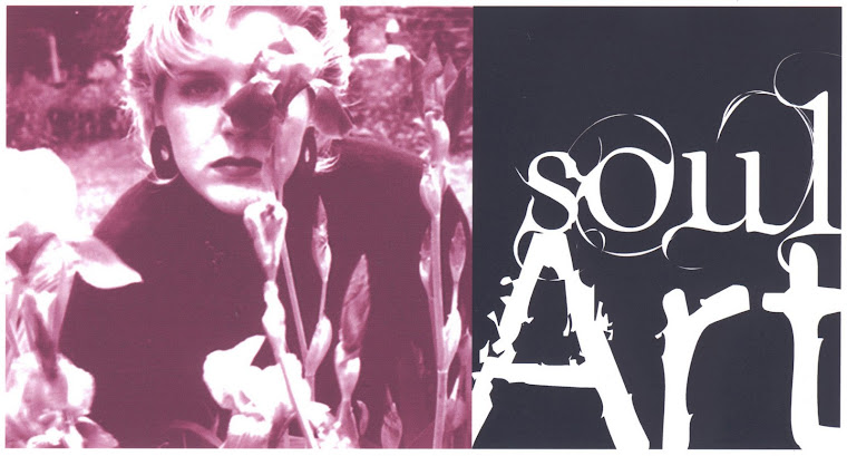
From the Start - 12" x 12"

From the Start - Detail of page layering and depth

From the Start - Detail of page layering and depth
The theme of "independence", in this case, brought to mind how I see myself, and so I focused on the ways I had displayed independence as a small child, through my journaling.
The strongest design choice I made to emphasize my focus included, choosing a photo of myself looking "independent" (to help the viewer get to know me, in respect to this month's theme). The various papers and details I further added to this page were used to show the variety of uses for the kit components, and how they can be used to create visual depth, interest, and fun... to any page, with any theme!

Stop - 12" x 12"

Stop - Detail of page layering and depth

Stop - Detail of page layering and depth
The theme of "independence", in this case, brought to mind how I feel in regards to a recent interaction with my father, in respect to my freedom. So, I wrote fairly candidly about this recent interaction, in an almost "poetic" fashion (as observed by my husband).
The strongest design choice I made to emphasize my focus included, choosing a photo of my hand, in an open palm position (to show the open, bare emotions expressed). I further used the kit contents to repeatedly encircle the title, (expressing my base reaction to the threat of loosing my freedom, through the strong title). Also, I decided to use black gesso to take out the background, so I had a "clean" surface to write out all of my journaling, (emphasizing my desire to have a clean slate, with my father). Plus, I decided to do some random doodling on the patterned paper, just because I could and I wanted to, (which is the antithesis of the result of loosing one's freedom).
1 comment:
I haven't been to your blog in ages Pamela...but it's so good to see you're still at it. Love your layouts - especially the Hand and the symbolism behind everything there :) Hugs.
Cathy
Post a Comment